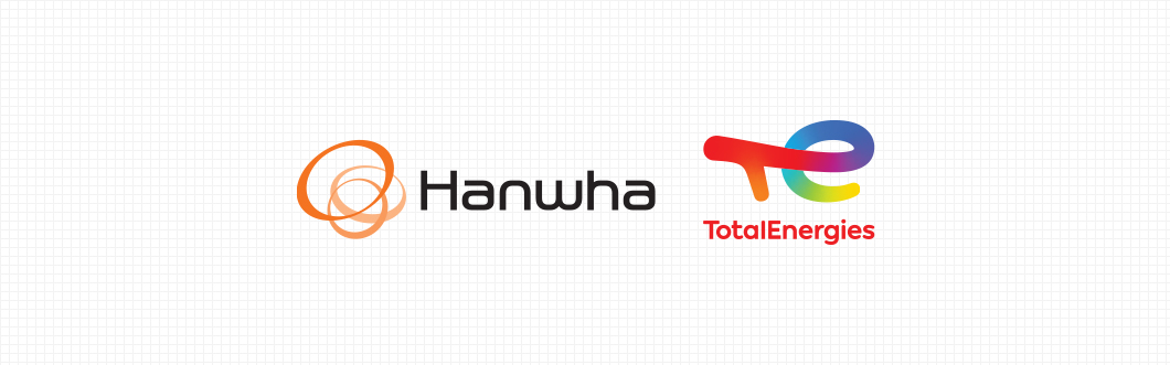
CORPORATE IDENTITY
The global energy · chemical company has become one to create a new future
that reflects people, technology, and the environment.
Hanwha TotalEnergies Petrochemical's CI is composed of
combinations of English name of the shareholder company.

-
Hanwha's CI consists of three circles that evolve, expand, and grow infinitely into the universe
through constant change and innovation. The three circles represent Hanwha Group that grows
into a global company by shaping the future of customers, society, and humanity through creative
encounters. In addition, it expresses the dynamic energy of three circles that expand and
grow infinitely in harmony. -

-
Total's CI is made up of round symbols that remind us of the earth, which means dynamic,
progressive momentum, as well as the world, the stage of Total business.
The four colors of Total symbol also mean wind, ground, water, and fire.
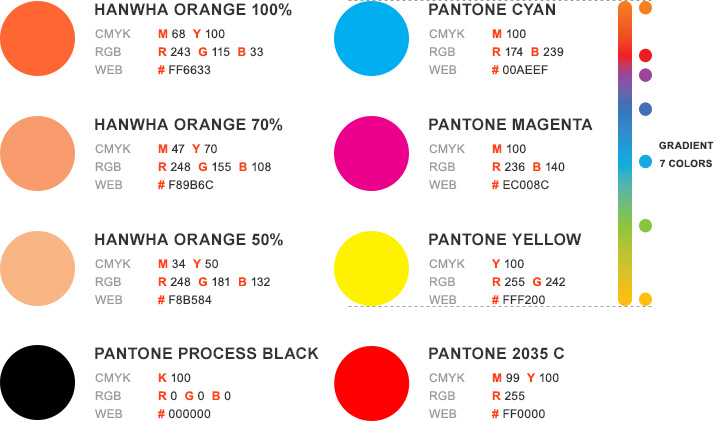
COLORS
RESULATIONS
As for the color representation of Hanwha Total, fore primary colors are applied first.
However, when the black color variation is applied, the symbol mark of each company
should maintain 3 Tone (Hanwha) / 4 Tone (Total). The representation of gold and
silver colors is only applied in special cases and should comply with the color regulations
for negatives when certain background colors are applied.
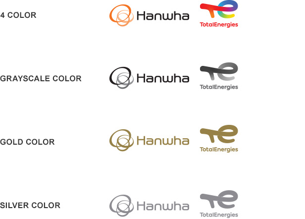
Korean logotypes of ‘한화’ and ‘토탈’ should be applied as the same logotype used in the company logotype(‘한화’ with Hanwha official font; ‘토탈’ with 맑은고딕). English logotypes of ‘Hanwha’ and ‘Total’ also should be applied as the same logotype used in the company logotype(‘Hanwha’ with Hanwha official font; ‘Total’ with Total Next font), with ‘Petrochemical’ in Arial Regular font.


